Notes on Lab Notebooks and Lab Work
Notebooks:
Lab notebooks are to be a complete record of laboratory effort. They must contain sufficient detail in the form of explanatory text, circuit schematics, and data, for another individual to be able to reproduce your measurements. This information must be recorded at the time the work is performed. In addition, the notebook is to contain all analysis of data, resulting graphs, and discussion of results and of any questions raised in the laboratory assignment.
Format requirements:
1. The lab notebook should be a bound volume, with pages large enough to allow easy pasting or taping-in of figures or graphs without folding up the insert. Graph-paper rulings help. These can be had at the bookstore.
2. The pages should be numbered.
3. The first page or the inside front cover should contain an up-to-date table of contents. Just add new items to the list as you go.
4. Data and commentary should appear only on the right hand side of facing pages. The left-hand page may be used for pasting in graphs produced separately in the analysis process.
5. Tables and figures (including schematics and graphs) should be identified by numbers and referred to by these numbers in any discussion or analysis. e.g. “... the circuit schematic in figure 1...,” or “Figure 3 is a graph of data contained in table 4....” Each lab should number tables and figures beginning at 1.
6. Discussion and text should consist of complete, grammatically correct English sentences. Be specific when writing sentences. Don't write vague comments such as “The following circuit was built.” Instead be precise: “The voltage follower shown in figure 3 was built.” “The output voltage is measured with a digital voltmeter (DVM) connected to points B and C as indicated.”
Grading criteria:
Labs will be graded based on the contents of the lab notebook. Each lab will be graded on a fifteen point maximum. Nine points will be devoted to the work as recorded at the time of the lab. This portion of the grade will be judged on: (a) completeness of the recorded work, including schematics, data, and comments allowing the work to be reproduced; (b) organization of the recorded information; (c) legibility, (d) observations of performance during the lab period. The guiding principle in recording information is to put yourself in the place of a person reading your notebook and make life as simple as possible for such an individual trying to understand and reproduce your work. Six points will be devoted to data analysis requested, including graphs and calculations, and discussion of questions raised in the laboratory assignment. Discussion should be in the form of complete sentences. Graphs should be clear and complete; information on proper graphical presentation of data is provided elsewhere. Calculations relevant to the data, symbolic or numerical, should be clearly presented. For extensive tabulated data all processed in the same manner, a single clearly presented sample calculation is sufficient. Reports lacking sufficient narrative content in the notebook will not receive full credit. The key test of the completeness of the notebook is to ask whether an individual who has not performed this work can take only the notebook into the lab and reproduce the measurements and analysis.
Laboratory Habits and Techniques:
1. Laboratory habits: It is important at the outset to cultivate good habits in the performance of laboratory work. This is especially important where equipment is shared among different lab teams. It is expected that in constructing circuits on the breadboard that the components and wiring will be laid out carefully. Use wire jumpers on the breadboard of the appropriate length. Circuits with unnecessarily long jumpers or leads are unacceptable. Why? Charlie's (Peck) Law states that: “All problems are cable problems”. This is actually a pretty good approximation. Neat, short wires help nip problems in the bud. Take the time to wire up each circuit carefully, keeping wires short and, whenever possible, laid out along orthogonal directions. Neatness counts.
Each lab station is provided with a parts kit. It is each lab team's responsibility to make sure this kit remain organized. At the end of each lab, return all wire jumpers and components to their proper bins. Take the extra few seconds to put resistors back in their proper place. Failure to maintain order in the parts kit will result in a lower lab grade. It will also cost you time in the next week when you have to waste time hunting for a missing component. If a component “breaks” or fails in some way, do not return it to the parts kit for someone else to use and rediscover. Inform the lab instructor of the symptoms (to know a part is bad you need to test it in some way) and dispose of it permanently when the problem has been confirmed. Most electronic integrated circuits used in the course are inexpensive, and the aggravation of “discovering” bad chips in the parts kit is not worth the small replacement cost. Take responsibility for identifying and solving these “problems” when they are first encountered.
Lastly, the laboratory experiments call for resistors of various values. Occasionally you may discover that the exact value mentioned in the lab or shown in the schematic is not included in your kit. Choose the closest available value. Keep in mind that in most of the labs, you will use inexpensive, carbon composition or carbon film resistors. The values given to these resistors by the manufacturer are nominal values. They typically exhibit a tolerance of 5%, so that the actual value may be as much as 5% above or below the value indicated by the color code imprinted on the resistor. If you need to know the actual resistance more accurately, perhaps for some calculation, measure it with an ohmmeter. In general,a circuit that depends upon a very specific value for a resistor is poorly designed. Get used to working with the commonly available nominal resistance values. Also, do not use precision (1% tolerance) resistors, also found in the parts kit, unless the lab instructions explicitly call for their use.
2. All good experimentalists make measurements with predictions about possible outcomes in hand. Results do not always agree with expectations. Such contradictions may reflect, among other things, incorrect predictions based on misconceptions about the physics involved or the measurements being made, a mistake in measurements or calculations, or a discovery of a new phenomenon. It is important to have a rough idea of the expected result of a measurement before making the measurement. This will allow a quick evaluation of the validity of the result. It is very easy to record vast quantities of utterly useless data if you don't stop to think about the measurements as you make them. Cultivate the habit of estimating what a measurement should be or what the scope display should look like before making the measurement. If your expectations differ from what you observe, ask yourself “Why?” instead of simply pressing ahead blindly. Whenever possible, use the notebook grid to make quick, rough graphs of data as you collect it.
Graphs are an important method of presenting scientific data. Well prepared graphs are useful in extracting information during the analysis of experimental results and in visually summarizing the important trends in a large set of data. Graphs for the lab notebook may be prepared by using separate sheets of graph paper and graphing by hand or using computer generated plots. These graphs should be pasted or taped into the notebook on the appropriate facing page. Gnuplot (or its descendants xmgr and grace) is a simple program for turning tables into pictures with minimum fuss. Windows folk are welcome to use excel, but beware: it lacks good error bars and likes to connect the dots for you.
An Introduction to the Oscilloscope
The oscilloscope (known to long-time users as simply “the scope”) is a widely used laboratory instrument for observing time-dependent electrical signals. It is, in essence, electronic “graph paper.” While some may regard it as the domain of the electrical engineer or mad physicist, it finds wide use in a variety of engineering and laboratory settings wherever events occur too rapidly for the human hand to record or the eye to follow without some assistance.
The first encounter with an oscilloscope is usually an intimidating event. Oscilloscopes seem to have an infinite number of controls. In most circumstances the controls you need to use are few in number. Most people who use oscilloscopes regularly become familiar with the details of the equipment only with extensive use and practice. Be patient and carefully watch the effects of each control as you (often desperately) adjust the various knobs and switches. Remember, even experienced scope users encounter difficulties when faced with a new model. It may help to understand a little bit about the principles of operation of the scope. Scopes come in a variety of forms. Virtually all operate using a cathode ray tube (CRT). The CRT is a vacuum tube - a seemingly ancient technology that still finds its most widespread use in television picture tubes and computer display monitors. Note that the description which follows is that of an “analog scope” - more modern “digital” scopes use a CRT but only as a display of stuff (like a computer monitor), rather than as the actual graphing hardware. The scopes we have in the lab now are HP digital scopes, but the controls are similar and it's handy to know about analog scopes anyway since digital scopes do their best to pretend to act like analog ones, so I've not deleted the nice descriptions below. The manuals for the HP scopes are in your lab bench drawers for learning the details of which knob does what: but it's very helpful to read the analog stuff below so you know what the knobs are supposed to be up to.
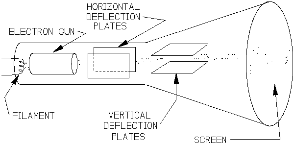
The CRT (see figure 1) consists of three essential parts:
(1) An electron gun - a source of electrons traveling in a beam (a “cathode ray” to old-timers from the 19th century). The electron gun begins with a heated piece of wire (the filament ) heated enough to allow some of the electrons in the metal to “evaporate” from the filament. These electrons are then pulled away from the filament, accelerated, and focused into a beam by a series of electric fields.
(2) A phosphorescent screen - this is the target the electrons from the gun normally hit. The screen is nothing more than the front end of the cathode ray tube, which has been coated on the inside with a phosphor - a material that converts the kinetic energy of the electrons into visible light. Wherever the electron beam strikes the screen, the phosphor lights up. Once the beam moves on to a new location, the phosphorescence quickly subsides.
(3) The steering mechanism - the means by which the electron beam is guided across the screen to make the whole device useful. Almost always the vertical position (vertical deflection) of the beam is controlled by an electrical signal provided by the user - i.e. a voltage that is applied (through various amplifiers and electronic wizardry) across a set of conducting plates (similar to a parallel plate capacitor) inside the CRT that deflects the electron beam by means of the electric field that must exist between the plates whenever there is a difference in voltage between the plates. The bigger the input signal from the user, the bigger the deflection. By careful design, the deflection is made proportional to the user-applied voltage. The horizontal position of the electron beam can be controlled two ways. Most often, an internally generated voltage ramp is applied to a separate set of parallel plates to cause the electron beam to deflect horizontally. This internally generated voltage looks like a ramp or saw-tooth pattern when plotted as a function of time. As a consequence, the horizontal position of the electron beam is swept smoothly across the screen from left to right with increasing time and then rapidly jumps back to the left-hand edge after the right hand edge is reached. This process usually occurs automatically and repeatedly, so that one has a graph of the input signal as a function of time being displayed continuously on the screen. When everything goes right, an intelligible display of the signal of interest appears; if instead a confusing image of seeming chaos appears on the screen, some adjustments of the controls may be needed. The alternative method of controlling the horizontal beam position is to use another user-supplied signal (voltage) to be applied to the horizontal deflection plates in the CRT. This allows the user to plot one signal as a function of another signal, and is usually referred to as the X-Y mode of the oscilloscope for (hopefully) obvious reasons. A physicist's primitive rendering of a CRT is shown in figure S.1.
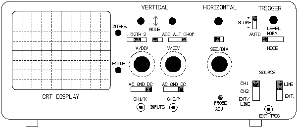
Figure S.2 is a representation of the front panel of a typical oscilloscope. It is divided into sections for convenience. We'll examine the main features of each section in turn. While individual scopes may place each set of major features in a different location, you should be able to find the essential items on any scope you encounter.
The
left most portion is the front end of the CRT where the signal is
displayed. Next to the CRT are a couple of controls for the display:
an intensity control to adjust the brightness of the displayed
pattern and a focus control. The intensity should be kept at a
moderate level. It is good practice to turn the intensity down when
the scope is on but not in immediate use. This prevents a pattern
from being permanently etched in the phosphor from an extended,
continuous exposure to the electron beam. The focus control keeps
the electron beam from the gun in a narrow beam, producing a
well-defined spot or trace on the display. If the trace is fuzzy or
blurred, try (1) reducing the intensity a bit and (2) adjusting the
focus control. Notice that the face of the CRT is divided up by a
grid pattern, just like graph paper. These grid marks are usually
referred to as divisions - typically eight divisions vertically and
ten horizontally. Most scopes have divisions that are 1 cm in size.
The divisions provide an easy way to make quantitative measurements
from the scope display.
The mid-portion of the scope holds the most important controls. These give the user the essential control over the horizontal and vertical deflection of the electron beam. They are the controls that are used most frequently. It is important to understand the role and significance of each one. We'll focus on the more important aspects of each of the controls and mention the subtler details later.
The vertical control section allows you to connect the signals you want to measure and to adjust circuits inside the scope that amplify those signals before sending them onto the vertical deflection plates. The scope illustrated, like the one employed in lab, allows two signals to be displayed simultaneously - it is a “dual-trace” oscilloscope. The two signals are labeled X and Y. The signal input connections are located near the bottom of the front panel and employ connectors known in the business as BNC connectors. These are coaxial connectors - two conductors arranged concentrically. The outer conductor is usually connected to GROUND; the inner conductor carries the voltage you want to measure or observe with the scope (measured, of course, with respect to ground). The outer conductor often serves as a shield, reducing the effects of unwanted interfering signals entering the system you're trying to study. BNC connectors and matching cables provide a convenient way of hooking up to various electrical instruments. The large knob above each input adjusts the vertical sensitivity for each input or channel. This controls the amplifier inside the scope that send the voltage onto the vertical deflection plates. If you are trying to look at a small (say a few 10's of mV (millivolts) signal, the signal needs to be amplified before it will produce a noticeable deflection of the electron beam. The vertical sensitivity control determines this amplification. Instead of specifying how much amplification is done, the control is expressed in units of volts/division (V/div) or millivolts/division (mV/div). This number indicates the voltage that would be needed at the BNC input in order to produce a deflection of the electron beam 1 division in the vertical direction on the CRT screen. Hence at a vertical sensitivity setting of 20 mV/div, a signal that deflects the electron beam 3 divisions vertically must have an amplitude of (3 div x 20 mV/div) = 60 mV. To observe large signals, one sets the vertical sensitivity to a larger setting, e.g. 2 V/div. (The scope is then in fact less sensitive since the same 60 mV signal will produce a much smaller deflection of the electron beam: (60 mV/2 V/div) = (.060 V/2 V/div) = .03 divisions -- scarcely noticeable on the display.) Each input (Ch 1 and Ch 2) has a separate vertical sensitivity control. This allows signals with drastically different amplitudes to be displayed on the CRT simultaneously.
Adjacent to the vertical sensitivity controls is the horizontal or “timebase” control. This controls the voltage ramp that drives the horizontal deflection plates. For convenience, it is calibrated in seconds per division: it tells the user that 1 horizontal division corresponds to the indicated amount of time. The shorter the specified time per division, the faster the electron beam is swept horizontally across the screen. At settings of .2 sec/div or longer (slower), you can watch the electron beam make its way across the screen. For very fast events or rapidly changing signals, you will need to set the timebase setting to a small value and it will not be possible to follow and individual sweep of the electron beam across the screen - it happens much too quickly. Since the display is 10 divisions across horizontally, the total time required to sweep the beam across the screen is 10 div x timebase setting. As an example, at a time base setting of 1 ms/div (10-3 seconds per division) it takes 1 ms for the electron beam to traverse one horizontal division and a total of 10 ms to sweep across the entire screen. Then the CRT display represents a window through which you can view a 10 ms segment of the signal(s) you apply to the input(s). Since the scope usually returns the electron beam rapidly to the left-hand side, another sweep begins almost instantaneously.
If the horizontal control or timebase switch is rotated fully counter-clockwise (through the “slower” settings) one reaches the X-Y setting. On this setting the horizontal position of the beam is not a function of time. Instead, on this setting the horizontal displacement is determined by the signal applied to channel 1 (X) and the vertical position is determined by the input signal applied to channel 2 (Y). This provides the ability to “plot” one electrical signal as a function of the other- the display becomes a representation of Y(X). This feature is not often used but can be very valuable in certain circumstances.
The right-most portion of the front panel is devoted to what is known as triggering. For the novice, this, without a doubt, is the most obscure part of the control panel. The purpose of this section is quite simple, but the number of options is usually overwhelming at first. To put it most directly, this section controls the electronics that initiates each horizontal sweep of the electron beam across the screen - i.e. it triggers the sweep. The basic options, without a lengthy explanation of all the sub-options) are:
AUTOmatic - whereby the scope starts the sweep on its own if it doesn't sense something more appropriate.
NORMal - this sends a copy of the input signal (the signal at channel 1 or 2) and attempts to start a sweep each time that input voltage reaches a preset value (trigger level). This allows the scope to sweep in synchronization with the signal your trying to study, producing (ideally) a stable pattern on the screen.
LINE - the horizontal sweep is synchronized with the frequency of the AC power lines- 60 Hz.
EXTternal - a third input (beyond channels 1 and 2) provided by the user is used to trigger the sweep. This is useful if you need to start the sweep at a well-defined time and the internal trigger mode is not stable enough.
These basic modes may appear with slightly different names on different scopes, but these basic functions will be provided. There are a number of additional options for triggering. They are briefly described later. When in doubt, as a starting point set the trigger controls for positive slope (see below), AUTO, CH 1. Adjusting the trigger level may help to achieve a stable display.
Additional Remarks on Scope Controls
While the following remarks apply to most oscilloscopes, some of the controls and their locations are specific to the old Tektronix model 2205. Not all of these features are illustrated in figure 2. Examine the scope you work with in lab to find these features on your particular scope.
VERTICAL and HORIZONTAL sections:
AC GND DC (Input coupling - located just above the BNC inputs on each channel) determines whether the the complete input signal (D.C. voltage + time dependent A.C. voltages) are sent to the deflection plates or just the A.C. (time-varying) voltage is displayed. The GND position allows the input to be connected to electrical ground (0. volts) internally so you can see where 0.V is on the display. Input coupling should be set to DC unless you have good reasons to use AC coupling.
POSITION: There are three position controls, one each for channels 1 and 2, and horizontal. These allow you to move the trace on the screen up or down for each channel or left/right. These controls are useful for setting the “origin” of the electronic graph when making quantitative measurements.
MODE: (Three separate switches on the 2205, located in the vertical controls section.)
CH1 BOTH CH2 - This switch allows you to select either channel 1 or channel 2 for display or both. When viewing only one signal, select the correct channel.
You can also invert channel 2 (NORM/INVERT), which effectively multiplies the input voltage at channel 2 by -1. Leave this in the NORM (non-inverted) position unless you have good reason to do otherwise.
The ADD ALT CHOP switch provides three options:
ADD displays (CH1 + CH2) on the screen (or (CH1 - CH2) if the INVERT switch is on).
ALT displays the signals from CH1 and CH2 on alternate horizontal sweeps. Remember,there is only one electron beam in the CRT and it has to display two signals.
With CHOP, the electron beam quickly jumps between CH1 and CH2 during a single horizontal sweep, giving the illusion of two simultaneous traces.
Suggested use: for slow sweeps use the CHOP mode when displaying both channels; the ALT mode can be distracting because the display will seem to flicker. At the fastest sweeps however ALT is usually better. In CHOP mode at the fastest sweeps you can see that the individual traces for CH1 and CH2 consist of short line segments. ALT will display one complete trace of CH1 and switch seemingly instantaneously to CH2 on the next sweep, providing a stable, continuous display of each input signal.
TRIGGER SECTION:
SLOPE - determines whether to start (trigger) a horizontal sweep when trigger signal is increasing or decreasing.
LEVEL - Determines the voltage level of the trigger signal at which a sweep will start.
MODE - Controls triggering method - lots of options, usually confusing
AUTO/LINE: horizontal sweep is begun when the selected source reaches the preset trigger level; however, in the absence of a reliable trigger signal, the sweep will start automatically.
NORM - horizontal sweep starts when trigger signal reaches trigger level; in the absence of a good trigger, the screen will be blank - no horizontal sweeps are performed.
TV FIELD - even more obscure, for TV repair persons.
SGL SWEEP - single sweep on specified trigger source; need to push reset to “re-arm” the scope for another event; most useful for taking pictures of a display.
SOURCE - Determines where the scope will try to find a trigger signal
CH1, CH2 - the indicated channel is used to generate the trigger signal for horizontal sweeps.
VERT MODE - a complex assortment of trigger sources depending on CHOP/ALT etc.
EXT/LINE - requires an external signal at the trigger input or selects the line frequency, depending on the position of the neighboring switch.
Recommended starting positions for switches:
VERTICAL SECTION
DC coupled
5 V/div each channel, VARiable knob fully clockwise
BOTH
NORM
CHOP
HORIZONTAL SECTION
x1 (and leave it there!)
1 ms/div, CALibrated knob fully clockwise
TRIGGER
SLOPE - positive
LEVEL - start in the middle
MODE - AUTO
SOURCE - CH1
These settings are such that under most circumstances, you should see something on the scope, even if it's just a couple of flat lines. Don't forget to turn the power on!
Graphical Presentation of Data
Presentation of experimental data in the form of graphs, in particular one measured quantity plotted as a function of another, most often using a Cartesian coordinate system, is perhaps the most efficient method of presenting the results of an experiment. It is far easier to recognize possible correlations between the two measured quantities when displayed on a graph than when displayed in tabular form as simply two (or more) columns of numerical values. A graph instantly reveals any qualitative trends that may link the “dependent” variable (usually the quantity that specifies the y-coordinate (or ordinate) of a data point) and the independent variable, usually plotted along the x-axis of a Cartesian system (abscissa). Carefully drawn graphs of data will also facilitate quantitative comparisons of the experimental data with various models or theories that seek to explain the data.
Essential features:
Graphs may be prepared in a variety of ways and in a variety of formats. Hand-made plots of data can be entirely satisfactory when carefully done. In situations for which the number of data points is not large, plotting by hand is efficient and provides a better feel for the data by the experimenter. For large quantities of data or for publication or presentation quality plots it is now conventional to generate the plots with the aid of a computer. With the ready availability of personal computers and powerful software, effective graphs may be easily and rapidly produced. High quality output from laser printers or pen plotters is now commonplace. Regardless of the means used to produce the plot, an effective and appropriate graph has a number of important features.
Since most plots involve two quantities (for example, time and position (t,y) measured simultaneously for a body in free fall) a plot will usually contain two axes, each representing one of the measured quantities. Therefore a properly prepared graph will include clearly drawn and labeled axes. Such labels consist of two parts. First is a clear indication of the range of values allowed along each axis and the value of the variable along each axis at various, uniformly spaced intervals denoted by “tic-marks.” Second is a title or label along each axis specifying what physical quantity is represented by that axis. If the axes are not labeled, there is no way for the reader to easily determine what the graph is supposed to represent. Therefore the axes should be labeled and the units of the measurement specified on the plot itself. When plotting by hand,choose a convenient interval between tic-marks that facilitates accurate plotting of the data. There should be no doubt in the reader's mind about where the axes on the plot are and what they represent.
The measured data (time and position for example, again) will span some range. The range of measured values dictates the minimum and maximum values to be included by the axes drawn. The range of values allowed by the axes should be sufficient to accommodate all the data to be plotted, yet not so large as to result in the data occupying only a corner or other small portion of the graph. Select ranges for the two axes so that the experimental data will occupy as much of the graph as possible.
The data points should be represented by neatly drawn symbols. The symbols should not be overly large. In the case of a graph in which several sets of data are presented simultaneously (perhaps the (t,y) data were collected for several different trials or for different objects) each distinct set of measurements should be represented by a separate symbol so as to identify which data are related as a set. For data sets in which the density is such that any reasonably sized symbols will overlap, it may be sufficient to simply plot points (or small filled circles).
Smooth lines through the data points should appear only when they serve a particular purpose. Such lines are useful when the data are so numerous so as to allow a continuous, smooth line to be generated by software to accurately represent the data. Alternatively, a smooth curve may be drawn through the data (not necessarily through each and every data point), usually by hand, to serve as a “guide to the eye” to emphasize a trend in the data or to make multiple sets of data plotted on the same graph more easily distinguished. A smooth line may also be plotted to represent the results predicted by some particular model or theory for the phenomenon under study. Jagged, “connect-the-dots” lines drawn between sparse data points are generally unacceptable; they rarely serve a useful purpose. Any smooth curve drawn, aside from very dense data sets, should be identified by its purpose (guide to the eye, theoretical model, etc.) in a caption near the graph. If several lines are drawn (perhaps representing different models), it is best to represent the various lines by different line styles (e.g. solid, dashed, etc.).
Experimental quantities are subject to uncertainties as a consequence of the finite resolution afforded by the measuring technique. The presentation of the data should therefore also indicate the uncertainties in the data being plotted. In some circumstances, the size of the symbol chosen is already larger than the estimated uncertainties and the addition of “error bars” is unnecessary. However, when the uncertainties are large (i.e. a significant fraction of the quantities being plotted), the error bars should be indicated. Note that error bars may be needed along both the vertical and horizontal axes of an x-y plot. Sometimes it is sufficient to indicate the typical uncertainties by affixing error bars to one data point to indicate the approximate uncertainty that applies to all the data.
Whenever a plot contains multiple sets of data and therefore different symbols, or various lines for theoretical models, a key or legend should be presented either on the graph or in a nearby caption identifying each important item. Figure 0 reflects the essential features of any good graph of experimental data.
Types of plots and graphical analysis:
Plotting data may require some analysis or manipulation of the raw measurements to produce the most useful plot. For example consider the data acquired in measuring the position of a falling body as a function of time (a set of t and y values). In introductory physics labs, such data may be obtained as a series of points along a waxed paper tape generated by a “spark timer” that marks the position of a falling body at regularly spaced time intervals. Assume that for convenience that y is measured positively in the downwards direction, and that the origins of y and t are taken to be the first such mark on the tape, so the marks on the tape do reasonably represent position as a function of time. In general the first data point on the tape (defined to be (t,y)=(0,0) by choice) need not correspond to zero velocity, since the object may have begun its descent before the first data point was recorded. A simple model (constant acceleration) predicts that the position should be given by a simple expression, y = yo + vot + gt2, where yo is the initial position at t=0 (here defined to be 0), vo is the initial speed, and g is the acceleration due to gravity. A plot of the data might look like Fig. 1. It reveals some curvature and therefore indicates some acceleration is taking place but does not provide easily interpreted evidence of the constant acceleration employed by the model. The data may be analyzed and plotted in a slightly different fashion however. Given the (t,y) data it is straightforward to produce instead a table of values of (t,y/t) and plot them, as in Fig. 2. Such a graph clearly reveals a reasonably good linear relationship between the experimentally obtained y/t and t. Furthermore, by taking the prediction of the simple model above and dividing both sides of the equation by t, one finds that the model predicts simply y/t = vo + gt. (Recall that yo has been taken to be zero by virtue of how the origin for y was chosen.) The quantity y/t is sometimes referred to as a compound variable. Hence the model predicts that a plot of y/t vs. t should be a straight line with a (y/t)-intercept of vo and a slope of g/2. Note that it is possible to read off from the graph directly the initial speed, and by measuring the slope of the line, to obtain a value for the acceleration of gravity, g. A simple manipulation of the raw data, when plotted, has provided very visible and quantitative verification of the prediction of the model - verification not available from the plot of the original raw data. In extracting the slope in the example above in order to obtain a value for the acceleration of gravity, it is important to keep proper track of units in order to obtain physically meaningful and accurate results.
Such plots discussed above correspond to “linear-linear” plots - both axes are scaled linearly with the data. In some circumstances it may be more useful to use a logarithmic scale for one or both of the axes. Log scales are useful when the range of data is very large, spanning several orders of magnitude (decades). For example, consider the gain (G, the ratio of output voltage to input voltage) of a particular amplifier (perhaps the pre-amplifier in a receiver) measured as a function of the frequency (f) of the input signal. A linear plot of G vs. f is shown in Fig. 3. As can be seen, the gain is low at high frequencies - the amp does not amplify high frequency signals very well - but most of the measured information is squeezed in to a small portion of the graph because of the wide range of frequencies tested. Little feel for how the amplifier performs at audio frequencies (up to 20 kHz or so) is conveyed by this plot. If instead a plot of G vs. log(f) is made,the data can be seen more clearly (Fig. 4). From this plot it is clear the gain has diminished noticeably for 50 kHz signals, but would make a reasonably good amplifier for most audio frequencies. Such a semi-log (or log-linear) plot may be produced in two ways. When plotting by hand, one can take the original (f,G) data, produce a table of (log(f),G) values with the aid of a calculator or computer, and plot on linear-linear graph paper with the x-axis being log(f) instead off (see fig. 4). Alternatively, one could use semi-log paper, which builds in the log directly into the grid printed on the paper, and plot the (f,G) data directly on the semi-log paper (Fig. 5). The graph paper in effect takes the log(f) for the experimenter. Software packages usually offer the ability to generate logarithmic axes on demand (see Fig. 6.).
Semi-log plots are also useful in situations in which exponential processes are expected to occur. For example consider the level of radioactivity exhibited by a short-lived isotope. The measured activity may come from a Geiger counter that perhaps counts beta particles (electrons) that are emitted during the decay of the isotope under study. The number of decays per second may be expected to follow an exponential decay in a simple model, so that the reading of the Geiger counter would be predicted to obey Nd(t)=Ce-t/, where Nd is the number of decays detected per second by the Geiger counter, as read from the counter. The constant C will depend upon how much radioactive stuff is present, and , the decay time constant, is related to the half-life of the isotope,a measure of how fast it decays - small values reflect rapid decay. This prediction suggests that the number of decays per second will decrease exponentially with time as the measurements are carried out. Therefore if Nd is measured over time and a plot of Nd vs. t is drawn up, the data should exhibit a downward curving trend (Fig. 7). If instead one takes the log10(Nd) the model predicts a straight line when plotted vs. t: log(Nd) = log(C) - (log(e)/)t. [Note: e=2.71828...,log(e)=0.434...; here one takes log10 logarithms since semi-log paper is based on base 10 logs and not base e. In these examples wherever log appears, base 10 is implicit; the natural logarithm will be denoted by ln.] Hence the model predicts a straight line with slope 0.434/. Once again a simple manipulation of the raw data into a more convenient form allows a more accurate and quantitative assessment of the validity of a theoretical model. Figures 8 and 9 show some of these techniques for exponential processes. Note that the background radiation from other sources makes the data depart from a straight line at large time values for the semi-log plots.
When faced with data that span several orders of magnitude along each axis it may be necessary to resort to a log-log plot. This is a graph in which both axes are scaled logarithmically. This technique is also useful when testing for general power-law relationships between the measured quantities - i.e. when the measured (x,y) values are thought to be related by a law of the form y=ax, where the value of the exponent may be predicted by the model under test. The preparation of log-log plots is similar to semi-log plots. One can take the logs of both sets of data (x and y) and plot these numbers on regular graph paper, or one can use log-log graph paper and plot the original (x,y) data, or even better yet, use a computer to help in in the whole process of graphing. Good software will allow either of the manual approaches to be implemented as desired.
As an example consider data obtained by measuring the heat capacity, C, of some exotic new substance as a function of temperature. The measurements are carried out over a temperature range of 1 mK to 10 K (four decades). Standard models for heat capacities will predict heat capacities with linear (CT) or cubic (CT3) dependencies on temperature at such low temperatures. While a linear-linear plot might reveal the possibility of a linear dependence, the validity of the relation over the entire measured range would be in doubt because of the severe compression of the very low temperature data. Any curvature observed in the linear plot would suggest the possibility of a power law dependence. If a general power-law relation is assumed, C(T)=aT, taking the log of both sides leads to log(C) = log(T) + log(a), which shows a linear relation between log(C) and log(T),regardless of the value of the exponent, . A log-log plot can reveal the value of the exponent from the slope of the line (assuming the data in fact fall on a reasonably straight line). Figure 10 shows heat capacity data on a linear-linear plot. Log-Log plots, obtained in two ways in Figs. 11 and 12 illustrate some of these points. In this particular example, the low temperature behavior (below about 0.5K) is dominated by a linear dependence on T. At higher temperatures, the data closely follow a cubic trend. Such behavior is characteristic of metallic materials. Figure 13 is a graph of the data by hand using log-log paper, analogous to fig. 12, which was produced with software. Note that paper with an adequate number of cycles (decades or orders of magnitude) is needed to cover the full range of data.
A few additional comments regarding log axes are worthwhile. The first point is to recognize that the log is defined for dimensionless quantities. For example, the absolute temperature,T, is measured in K (Kelvin) and the quantity log(Kelvin) has no meaning. By writing log(T), one usually means that the the log is taken of the numerical value of the temperature when that temperature is expressed in units of K. This is best made explicit in labeling an axis, e.g. instead of simply log(T), writing log(T(K)), to make it clear to the reader how the axis is generated. Equivalently one can think of the process as dividing the measured data by the unit of measure so, for example, that by log(T) one really means log[T/1K], when T is measured in Kelvin. Often it is obvious from the context what the “normalization” is, but it never hurts to add the unit of measure for clarity.
A second point is in regard to extracting slopes from semi-log or log-log plots to determine values for parameters used by a particular model (e.g. or used above). Often the slope to be determined may be the slope of a straight line drawn simply by eye to best represent the data. To find the slopes on data plotted by directly computing logs before plotting and plotted on “regular” graph paper or linear axes, the process is straightforward and can proceed analogously to that employed for a linear-linear plot. For plots employing log-log or semi-log paper (or axes) one must be more careful. When using this method, think and proceed carefully to get the proper conversion factors, or, to be safe, manually calculate logs as needed and calculate slopes as for a linear plot. For log-log plots on log-log paper it may also be possible, with a little bit of thought, to read off the exponent by inspection. If software is used for graphing purposes, often the software will allow a “least squares fit” of the data to a particular model and produce automatically the values of the parameters that provide the best agreement with the measured data. These are very convenient routines but should not be used blindly.
Resistor Color Code:
|
Black |
0 |
|
Brown |
1 |
|
Red |
2 |
|
Orange |
3 |
|
Yellow |
4 |
|
Green |
5 |
|
Blue |
6 |
|
Violet |
7 |
|
Gray |
8 |
|
White |
9 |
For carbon film or carbon composition resistors (5 or 10% tolerance), three colored bands are used to indicate the resistance value followed with another band to represent the tolerance. If the colors represent three digits decoded by the above list as a-b-c, the resistance value is given a b 10c. So yellow, violet, brown translates into 4-7-1 47 101 = 470Ω. Tolerances are represented by gold (5%) and silver (10%) fourth bands. Metal film resistors, which are generally manufactured to 1% tolerances require a third significant figure to specify the value to 1%. Then there are four colored bands to represent the value - three significant figures and the multiplier - followed by a fifth band to encode the tolerance. For example, yellow-white-white-red 4-9-9-2 49900Ω =49.9kΩ. The tolerance band on 1% resistors is brown (1), which can lead to occasional confusion about which end of the colors to begin with. Careful inspection usually reveals the tolerance band is spaced away from the four bands coding the value.
PARTS KIT CONTENTS:
Resistors:
Carbon (5%) Quantity Value(Ω)
10 47
10 100
10 220
10 470
10 1k
10 2k
10 5.1k
10 10k
10 20k
10 51k
10 100k
10 510k
10 1M
10 4.7M
Metal Film (1%) Quantity Value(Ω)
10 1k
10 2k
10 4.99k
10 10k
10 20k
10 49.9k
10 100k
10 1M
Trim Pots:
1 5KΩ
2 10kΩ
1 100kΩ
Capacitors:
Ceramic disc assortment kit (100 - 100000 pF)
Filter capacitors: 22, 125, 1000 F
Inductors:
1 680H
1 8200H
Diodes:
Signal 4 1N4148 or 1N914
Rectifier 6 1N4003
LED 8 red
Transistors:
4 2N2222A NPN
6 2N3904 NPN
2 2N3906 PNP
Op-amps:
4 LF411 FET inputs, general purpose
2 LM741 General purpose
Miscellaneous Analog ICs:
2 78L05 Voltage Regulator, +5V @ 100mA
2 LM566 VCO/Function generator
2 LM311 Comparator
Display Elements:
2 1 digit, 7-segment LED display, common anode
1 2 digit, 7-segment LED display, common anode
1 4 digit, 7 segment LED display, common cathode, muxed, use with 74C925
Miscellaneous Transducers:
1 Electret microphone, requires biasing, +5V through 1k resistor
1 Speaker with 47Ω resistor in series
1 CdS photo-resistor
1 Miniature incandescent bulb with leads for breadboard
Switches:
2 Momentary contact, normally open (NO)
2 Momentary contact, normally closed (NC)
Transformer:
1 Power supply, 120VAC primary, ~8VAC output, with power cord
Clock:
1 Crystal oscillator, TTL compatible, 1MHz
Converters:
1 DAC0808 8 bit Digital-to-Analog converter (DAC)
1 ADC0804 8 bit Analog-to-Digital converter (ADC)
Digital Logic ICs:
|
LS TTL (74LSxxx) |
HCT CMOS |
||||
|
Quantity |
IC |
Function |
Quantity |
IC |
Function |
|
4 |
74LS00 |
NAND |
4 |
74HCT00 |
NAND |
|
2 |
74LS02 |
NOR |
2 |
74HCT02 |
NOR |
|
2 |
74LS04 |
INVERTER |
2 |
74HCT04 |
INVERTER |
|
2 |
74LS05 |
O.C. INVERTER |
2 |
74HCT08 |
AND |
|
2 |
74LS08 |
AND |
2 |
74HCT14 |
Schmitt Trig |
|
2 |
74LS32 |
OR |
2 |
74HCT32 |
OR |
|
2 |
74LS47 |
BCD DRIVER |
2 |
74HCT74 |
D F-F |
|
2 |
74LS86 |
XOR |
2 |
74HCT86 |
XOR |
|
2 |
74LS90 |
DEC. CTR. |
2 |
74HCT107 |
JK F-F |
|
2 |
74LS107A |
JK F-F |
2 |
74HCT112 |
JK F-F |
|
2 |
74LS112A |
JK F-F |
2 |
74HCT193 |
COUNTER |
|
2 |
74LS124 |
VCO |
2 |
74HCT221 |
ONE-SHOT |
|
2 |
74LS193 |
COUNTER |
2 |
74HCT4066 |
SWITCH |
|
2 |
74LS251 |
MUX |
2 |
74HCT4510 |
COUNTER |
|
2 |
74HCT4518 |
COUNTER |
1 |
74C925 |
4 DIG CTR |
Cables and Connectors:
4 BNC-BNC cables, 1 m long
4 BNC-Mini-grabber cables
3 BNC Tees
2 BNC Unions F-F
3 BNC-Banana Plug adapters